Announcing the release of seaborn 0.11

Today sees the 0.11 release of seaborn, a Python library for data visualization. This is a major update with a number of exciting new features, updated APIs, and better documentation. This article highlights some of the notable features and updates; see the seaborn website for detailed release notes.
Modernized distribution plots
The distribution plots have been completely rewritten for this release, modernizing the APIs, enhancing existing capabilities, and adding exciting new features. With these changes, you can visualize conditional distributions via semantic mapping and faceting with just a single declarative function call:
sns.displot(
    data=penguins, kind="hist", kde=True,
    x="flipper_length_mm", col="island", hue="species",
)
(This example uses Allison Horst’s fun new Palmer Penguins dataset).
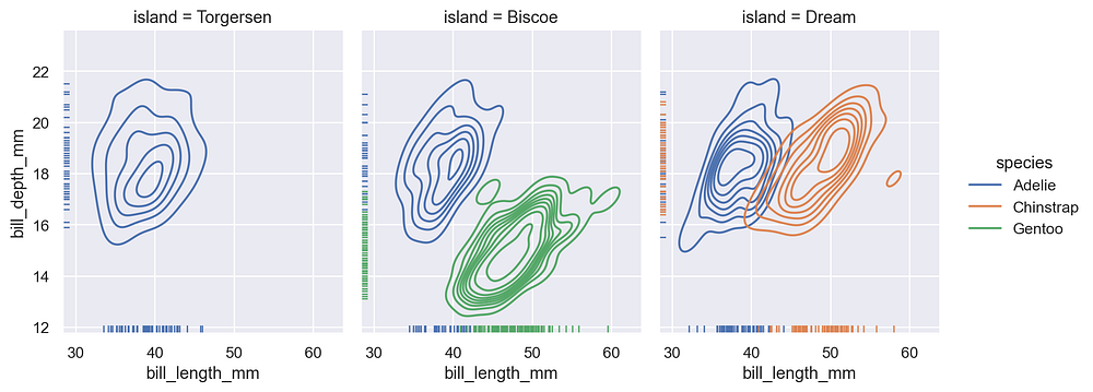
This major new function, displot, offers a figure-level interface to the various forms of distribution plots in seaborn: histograms, kernel density estimates, empirical distributions, and rug plots. Most of these options support both univariate and bivariate visualizations:
g = sns.displot(
    data=penguins, kind="kde", rug=True,
    x="bill_length_mm", y="bill_depth_mm",
    col="island", hue="species",
)
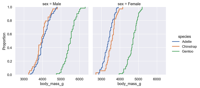
Completely new to seaborn, empirical distribution (ECDF) plots are a statistical technique that facilitates quantitative comparisons between distributions:
g = sns.displot(
    data=penguins, kind="ecdf",
    x="body_mass_g", col="sex", hue="species",
)

The new distribution plots natively support categorical and datetime data, they handle log-scaled axes transparently, and there are new parameters for intuitively controlling the histogram binning and density smoothing. Histogram counts can be normalized to show either the density, probability, or frequency of observations in each bin. Multiple distributions can be layered, stacked, or dodged. Weighted estimation is possible in all distribution plots.

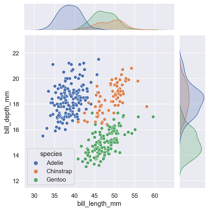
Now that the axes-level distribution plots support semantic mappings, seaborn’s composite plotting functions do as well. Showing the joint and marginal distributions of two variables while conditioning on a third variable is as easy as
sns.jointplot(
    data=penguins,
    x="bill_length_mm",
    y="bill_depth_mm",
    hue="species"
)
Highlights of the other features and enhancements

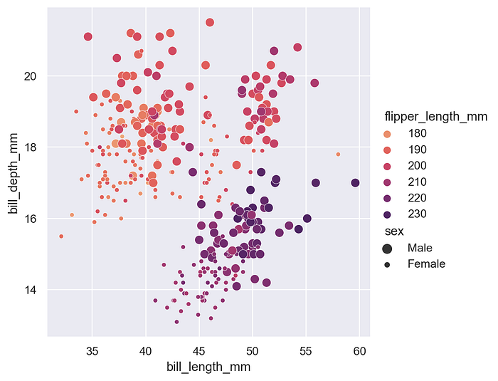
While the distribution plots have the most exciting new features, important enhancements have been made throughout the library. For example, you should now see better results when semantically mapping numeric variables in the relational plotting functions (relplot, scatterplot, and lineplot), and two new perceptually-uniform colormaps (“flare” and “crest”) have been created for use in this kind of plot.
The code that ingests data has been refactored, and support for both wide- and long-form data has been standardized and improved. While it’s most common to use seaborn with pandas dataframes and to specify data mappings using named variables, seaborn is quite flexible about how its input data can be represented. A new chapter of the user guide demonstrates this flexibility and explains how seaborn views datasets. While data ingest is not yet fully consistent across the library, it will become so over the next release cycle.
The documentation has been improved in numerous other ways, including a new user guide chapter explaining how seaborn functions are organized, including a discussion and comparison of the critical distinction between “axes-level” and “figure-level” functions. The color palette tutorial has been revised to give more color theory background and motivation for why you would choose different color palettes. And a rewritten distribution tutorial demonstrates the new features while providing guidance on how best to use each kind of plot.
Transition to enforced keyword arguments
With these new features comes some important API changes. Notably, the plotting functions (both old and new ones) now require nearly all of their arguments to be passed with explicit keywords. In v0.11, using positional arguments triggers only a warning, but this will become an error in future versions, so you should update your code.
As the documentation has long used explicit keywords in nearly all examples, this will hopefully not be too disruptive. Enforcing keyword arguments will make it easier to add new features to the library while keeping the function signatures organized and the function calls interpretable. Once the change is in full effect, the signatures will be reorganized so that data is the first argument for all functions. This will make it easier to pipe pandas dataframes into seaborn functions. And, with the enhanced support for wide-form data, it means that calling any plotting function as plot(data) will work for a very range of data formats.

Adapting to changes in the distribution module
The new distribution plot features are naturally disruptive. Here is some advice to help you adapt your code. Lots of effort was devoted to smoothing the transition, but it will be wise to check your plots carefully before and after updating.
Replacing calls to distplot
As part of these updates, the original distplot function has been deprecated and will eventually be retired. If you use distplot for histograms, it can be replaced in two ways:
displot, a new figure-level function, which should be used in most situations, because it supports faceting and puts the legend outside of the plothistplot, a new axes-level function, which should be used in situations where you need to plot a histogram onto an existing matplotlib figure
For simple plots where x is a vector of data, displot(x) and histplot(x) are drop-in replacements for distplot(x). Both functions also allow you to add a KDE curve by setting kde=True. As an enhancement, the new functions will plot a KDE over a histogram that shows counts, rather than requiring density normalization. If you use distplot to show just a KDE, use either displot with kind="kde" or the axes-level kdeplot.
It is likely that the similarity in names between displot and distplot will cause some confusion during the transition, which is regrettable. There was really no better name for a new figure-level function that makes distribution plots. If it helps, the etymology for “distribute” is dis- (apart) tribure (to assign), so at least the new term splits the word in the right place.

Updating calls to kdeplot
Unlike distplot, the kernel density enhancements were implemented by adapting the existing kdeplot function. Old code should continue to work, but in some cases it will trigger a FutureWarning or UserWarning if it uses a deprecated or updated API. The pull request on GitHub has an extensive explanation of each change.
Simple calls, like kdeplot(x) will work the same way as before. But to use the new features, you’ll need to explicitly assign your data and variables. The parameters now follow the standard data, x, y, hue API seen in other seaborn functions.
Several of the optional parameters in kdeplot have also been modified. Notably, the ambiguous bw parameter is replaced by bw_method and bw_adjust. In most cases, you will want to tweak bw_adjust: a factor that scales the default bandwidth for all distributions shown in the plot.
The old version of kdeplot could use either statsmodels or scipy to compute the density estimate. This added complexity without a clear benefit, so the statsmodels backend has been dropped in the rewrite. This means that the new version supports only Gaussian kernels. Additionally, there were some differences in how the two backends interpreted various parameters (bw, and clip are notable examples). Default behavior should be the same, but you may see differences in your plots if you were setting other values.

Upgrading to the new version
When you’re ready to upgrade, these features and many more are just a pip install away:
pip install seaborn==0.11.0If you need help , a new seaborn channel has been created on the Matplotlib discourse forum. This complements the use of StackOverflow for targeted Q&A and GitHub for reporting bugs.
